March 9th, 2017. It’s one of the first warm days of the year in St. Louis, and the doors to the gymnasium at Stevens Middle School are open to let the sun stream in. Stevens, built in 1964 a few blocks North of Delmar Boulevard, is one of thirty-two schools in the city that have closed in recent years, its front gates locked with heavy chains, its long hallways empty. The asphalt parking lot out back is cracked, tufts of sharp grass the first signs of a inevitable reclamation. Over the last few weeks, though, the school has found a new life; inside the gym, a class of ninth graders are on their hands and knees atop a wide platform made from reclaimed brick, drawing with fat sharpie markers.
They’re making a map.

The kids have decided together, over the last few weeks in class, that their map will be about the places in their neighbourhood that they felt were safe. And so they draw their school, Brittany Woods, at the middle left. Beside the school someone adds the local Jack in the Box, and writes in a rough scribble : “I like to eat here.” Many of the kids draw their own houses. “I like my house because I can be myself there,” one student writes.” “I like my house because it’s a sign of love,” reads another note. “No matter what troubles I have my family loves me anyway.”
The students mark some of the locations with an X in a circle, indicating that these places are not safe. Right at the middle of the map, someone draws Jackson Park, and marks it with an X. “I have shed many a tear here,” they write beside it. While all of these places are being added to the map, a small group is drawing a key. The key tells us that the places on the map are outlined depending on who they feel safe (or unsafe) for. Male in green, female in red, gender neutral in purple. African Americans in brown, caucasians in pink, biracial in blue. Reading the map with the key, we can see that some places are specifically coded as safe for certain people. Jackson park, ringed in brown and pink and blue, seems to be unsafe for everyone.
When the students are nearly done their map, a group of four of them draw a rainbow, right in the center. LOVE IS LOVE, someone writes on top of the rainbow. LGBT, they add, below. “Love is love, no matter what.”

May 15th, 1937. A Saturday, eight decades in the past. Another map is being drawn. With a straight edge, the map-maker marks out a kind of geometric jigsaw puzzle onto the city and then he fills each piece, one by one, with a color. Green, blue, yellow green. First Grade, Second Grade, Third Grade, Fourth Grade. This rainbow-ed map of St. Louis is one of hundreds of similar maps of cities that are being made across the nation, in the wake of the Great Depression, with the support of The Home Owners Loan Corporation. The HOLC, recently born of the New Deal, has a remit to re-finance mortgages that are currently in default, in an effort to avoid foreclosure and thus to offer a lifeline to failing cities. Maps like the one being drawn are to act as guides to HORC officials, showing in which areas of the city they should offer support, and in which ones they shouldn’t.
As we watch, this 1937 map-maker colors in a polygon with green, just to the North of the city’s sprawling Forest Park. The people who are lucky enough to live in this First Grade polygon will very likely get government money. They’ll keep their homes. A few minutes later, the map-maker shades in another region with red. Fourth Grade. Under the shade of these red lines, the people will get no money from HORC, no support in the face of their mounting debts. At worst, they’ll lose their homes; at best they’ll become more deeply entrenched in financial despair.

We know now that the HORC’s maps were racist instruments, half-heartedly hidden under ideas of renewal and ‘residential security’. Red-lined areas were almost always African American neighbourhoods, and these maps became tools to deny black people property rights, to force them out of home ownership, to remove them from real-estate based capital systems and thus from civic discourse. Those map-makers, on that May day in 1937 were setting out a vision for the future of their city — their own white future, a new map of their own white city.

Back in the gymnasium, the students are gathered around the edge of their finished map. The project’s facilitator, Emily Catedral, is showing them how they can use an iPad interface to project dozens of data layers on top of the map they’ve drawn. She walks them through some data gathered and scraped from census records and city data repositories — employment rates, property values and annual income. Traffic, and pollution. The number of no-car households. Distance to primary care facilities. The students notice quickly that, although each of these map layers show a different thing, they have a similar visual pattern, a kind of houndstooth shape that shows up in every map.
Then Emily taps the iPad and projects the red-lining map from 1937 on top of the map they’ve made today. The students see their own neighbourhood as those map-makers saw it eighty years ago. It takes a few minutes for them to decipher the key, and then they find it: there is that same shape! Indeed, they realize, this red-lining map was still present in almost every map they’ve looked at. Sometimes its edges were faded a little bit, but there it was, again and again.

“The historical map that showed home loan ratings was very powerful because kids understand that the A neighborhoods are still filled with big beautiful houses — and white people,” said the teacher, Anne Cummings. “The D ratings I could identify as historically black neighborhoods and could speak to the fact that the one near my home was considered blight and claimed through eminent domain. There’s a Menards there now, that my family and others have boycotted.”
This connection– between the current conditions of their neighbourhood and the racist policies of the 1930s– wasn’t the only one the students found during their time in the Map Room. “We used the bus route overlay and the one about households that own cars to talk about the lack of crosswalks on one of our major thoroughfares,” Cummings told me. “It’s just south of our district’s poorest elementary school, and people are often hit or nearly hit.” The students also spent time comparing maps showing healthcare enrollment and asthma prevalence, once again overlaying this information on top of their own map to help find themselves and their daily lives in the data.
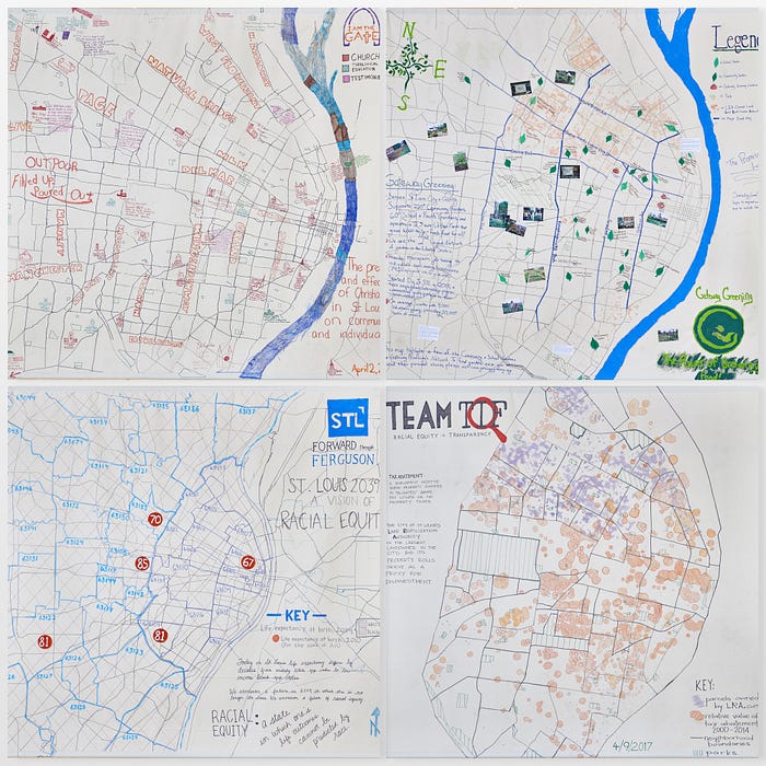
Over the course of five weeks, thirty other groups made 10 foot by 10 foot maps in the gymnasium. Forward through Ferguson, a organization who is looking to promote avenues for lasting change out of The Ferguson Report, made a map showing the drastic difference in life expectancy between black and white communities in the city. Gateway Greening mapped out every community garden within the City of St. Louis. Team TIF compared the city’s LRA properties to tax abatements, challenging the commonly heard assertion that these abatements are being used to incentivize development in ‘blighted’ areas. Many of the mappers chose to render their personal stories onto their maps, marking places that held meaning to them, offering anecdote and emotion to go alongside statistic. A map showing Christian churches is densely annotated: “I am the first in my family to graduate college,” someone has written beside the Ministerio Apostolico Plantio Del Señor. “I NEVER thought I could get a Masters degree, let alone a Doctorate.”
Dickson Beall, a reporter and art critic from the city’s South County Times, came perhaps closest to capturing the intent of the project, in a review that he published shortly after the space opened. “The Map Room,” he wrote, “is an instrument for re-visioning how urban societal change can happen.”
I came to think of the Map Room, over the four years it took to develop and the five weeks when it was open, as a machine for changing perspective. It was a place to come and not only tell stories about your city through map-making, but also to understand it through the eyes of others. When you look at a map of your own city, showing property values or lead levels or density of greenery, it’s easy enough to find your own story in that map. What is harder is to find the stories of others. Map Room let the citizens of St. Louis see their city through the eyes of ninth graders, the homeless, bike commuters, city workers, activists and artists. It tried to move civic data from being a resource for urban planners and academics to being a exploratory medium for everyday citizens. It offered a hint as to what new kind of civic data space — to go alongside libraries and community centers- might look like.
As I’m writing this, there are teams in four other cities and towns who are working on Map Rooms of their own. New Orleans, Atlanta, Stroudsburg, New York’s Lower East Side. They’re gathering city data, designing curricula, connecting with community groups, and building spaces. They’re making their own perspective-changing machines, ready to empower their next generation of map-makers and urban re-visioners.
I have my fingers crossed that they are just the start.

The St. Louis Map Room ran from March 3rd to April 9th, 2017, at Stevens Middle School. The project is nominated for 2018 Robert E. Gard Award, from @Americans4Arts.
St. Louis Map Room was a collaboration between The Office for Creative Research and COCA.
The St. Louis Map Room Team was tireless, endlessly enthusiastic, and beyond counting. Key players included Chris Anderson, Ann Aurbach, Emily Catedral, Jane Friedhoff, Gabriel Gianordoli, Genevieve Hoffman, Kelly Pollock, Kate Rath, Jennifer Stoffel, Jer Thorp, and Noa Younse.
All hardware, software, teaching materials and strategies used for St. Louis Map Room are open source. A full toolkit of these materials along with a step-by-step guide for building a Map Room will be available in the coming weeks. To find out more about opening a Map Room in your own community, get in touch.